Queering the Map
A UI case study on a community mapping project
Much of my work for companies utilizes existing design systems, component libraries, or UI patterns. This is to maintain consistency with the product and brand ecosystem and provide speed for building. This project exists to show my own voice when it comes to UI and full freedom to design.
What is it
Queering the map is a volunteer run community mapping project. It exists to be an archive of global queer stories, showing that queer community is not limited to certain locations, neighborhoods, or cultures.
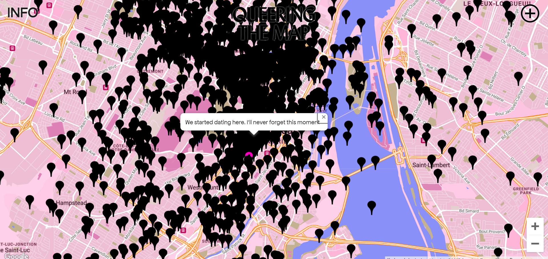
Screenshot of the existing Queering the Map Project
My Reimagining
I wanted to create a mobile native iteration of queering the map that has a clean and modern UI while keeping the feel of the original project.
I started by playing with map palettes.
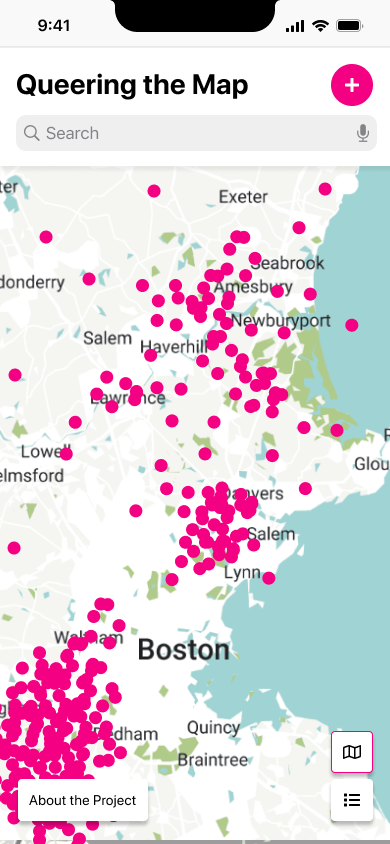
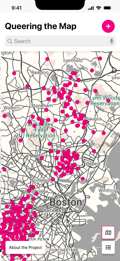
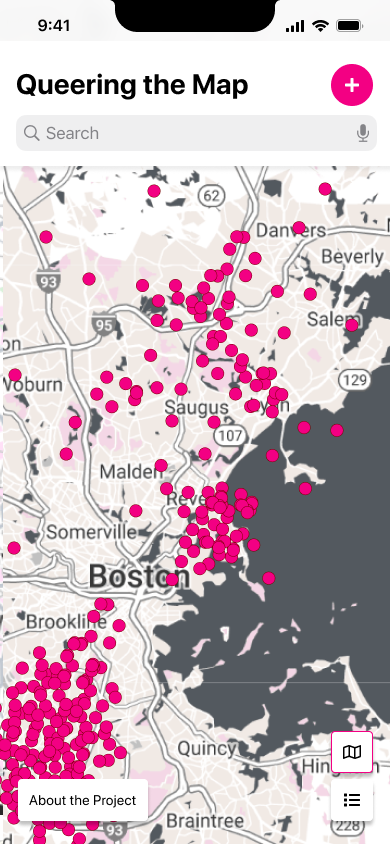
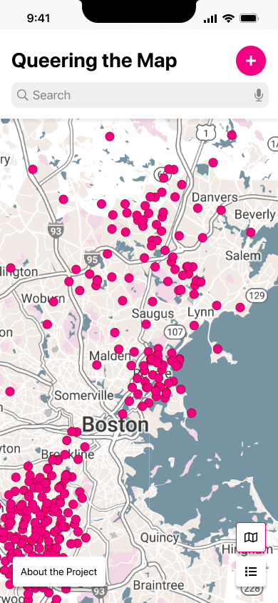
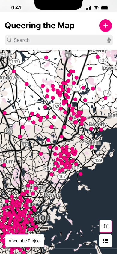
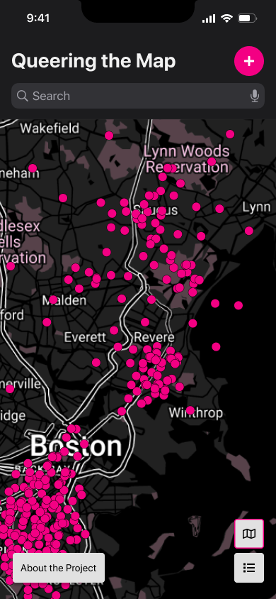
The goal here is to have a map that is easy to read, does not take away from visibility of the queer stories, and fits the general feel of the original projects. Maps were designed using googles style editor, an open source map API. I also wanted to play with flipping the original palette for a different narrative. Rather than having queer stories block out a map, I wanted to have queer moments light up the map.
Next, I started building out the screens and components needed, playing with how I can introduce more usability and accessibility.
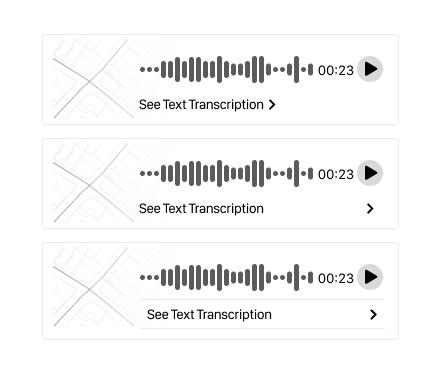
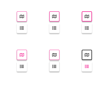
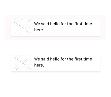
I iterated on individual components till I found the right fit that was clean, easy to navigate, and contained a compelling visual narrative.
Finished Project
The finished project is a mobile native app with both a light and dark mode.
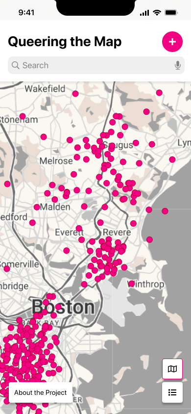
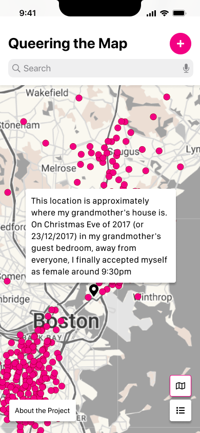
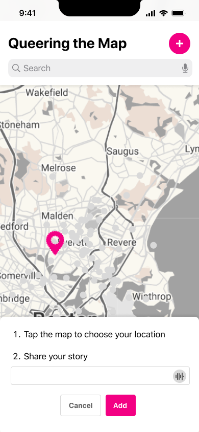
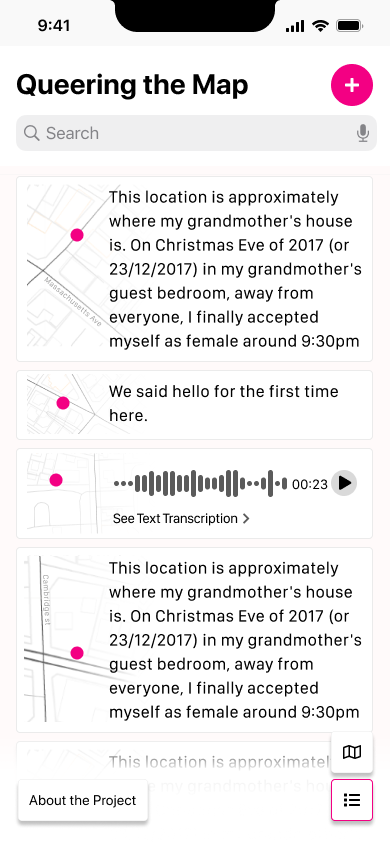
I went with a muted palette that allows the stories to be the most visually bold and compelling element. I added a clean header that provides text and voice search, and a call to action to add your own story. When adding your own story, I updated the palette to ensure that you can clearly see where you are adding, as well an option to record your story to added personalization and narrative components. Lastly, I included a list view that would allow users to read stories endlessly without having to continuously click.
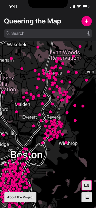
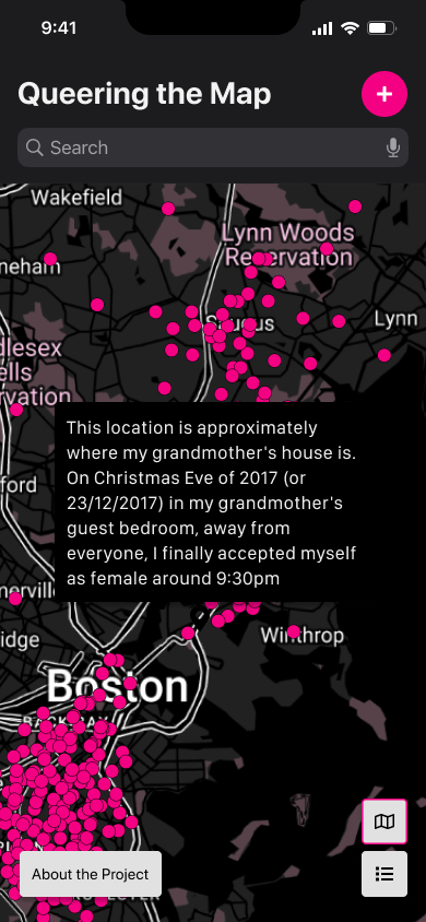
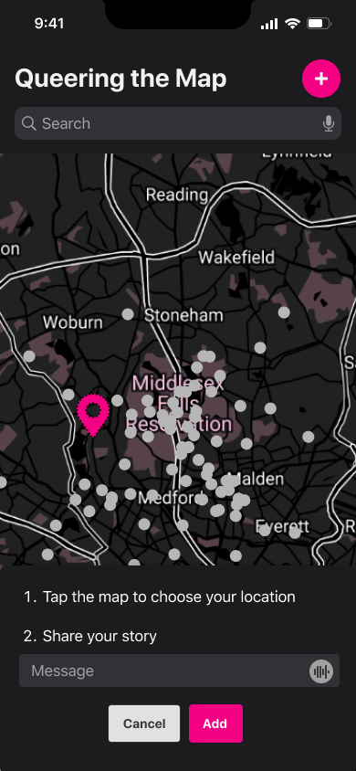
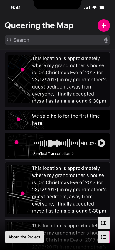
For dark mode, I played with a charcoal and black palette, adding small details such as light borders to help provide additional color contrast for ease of viewing. The color palette still aims to put the story moments first, using those pink queer dots as a way of lighting up a global map.