Reggora Vendor Application
Onboarding Overhaul for an Appraisal Management Platform
Goals
Redesign the onboarding experience to address problems of low activation rates, poor data accuracy, and incorrect sign ups. Additionally, I worked with the product team to include goals of addressing scalability to future user types.
The onboarding redesign saw an increase of app conversion (users able to sign up and have accepted their first order) from 34% of users to 74% of users. It also changed abandonment in the sign up flow from 60% of users dropping to 4.5% of users dropping.
Process
The process started with an audit of the existing sign up flow, and data collection from users on friction points. This data collection came primarily from our customer service teams, pinpointing what portions of the application users get stuck on. We were also able to get basic metrics on drop off points. I also performed an audit of the sign up flow as a new user. Below are some notes from the audit:
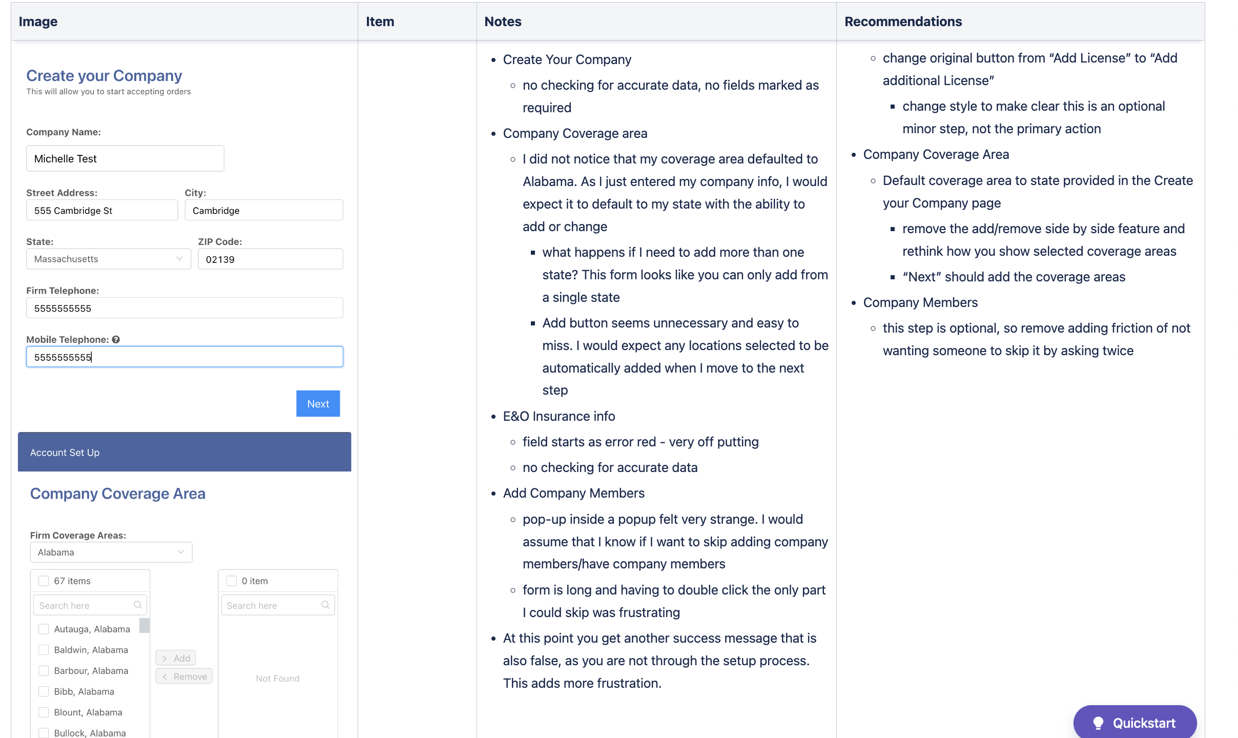
The initial sign up flow had a few major pain points.
It was unclear what was required and when the flow ended. Multiple success screens made a user feel they were finished, and new unexpected steps required pieces of information that they did not have on hand (tax information, etc).
Bulky forms with no validation. It was unclear when a user had missed pieces of information, and we were not checking for valid inputs causing false data.
Confusion once in app on what still needed to be completed in order to accept an order.
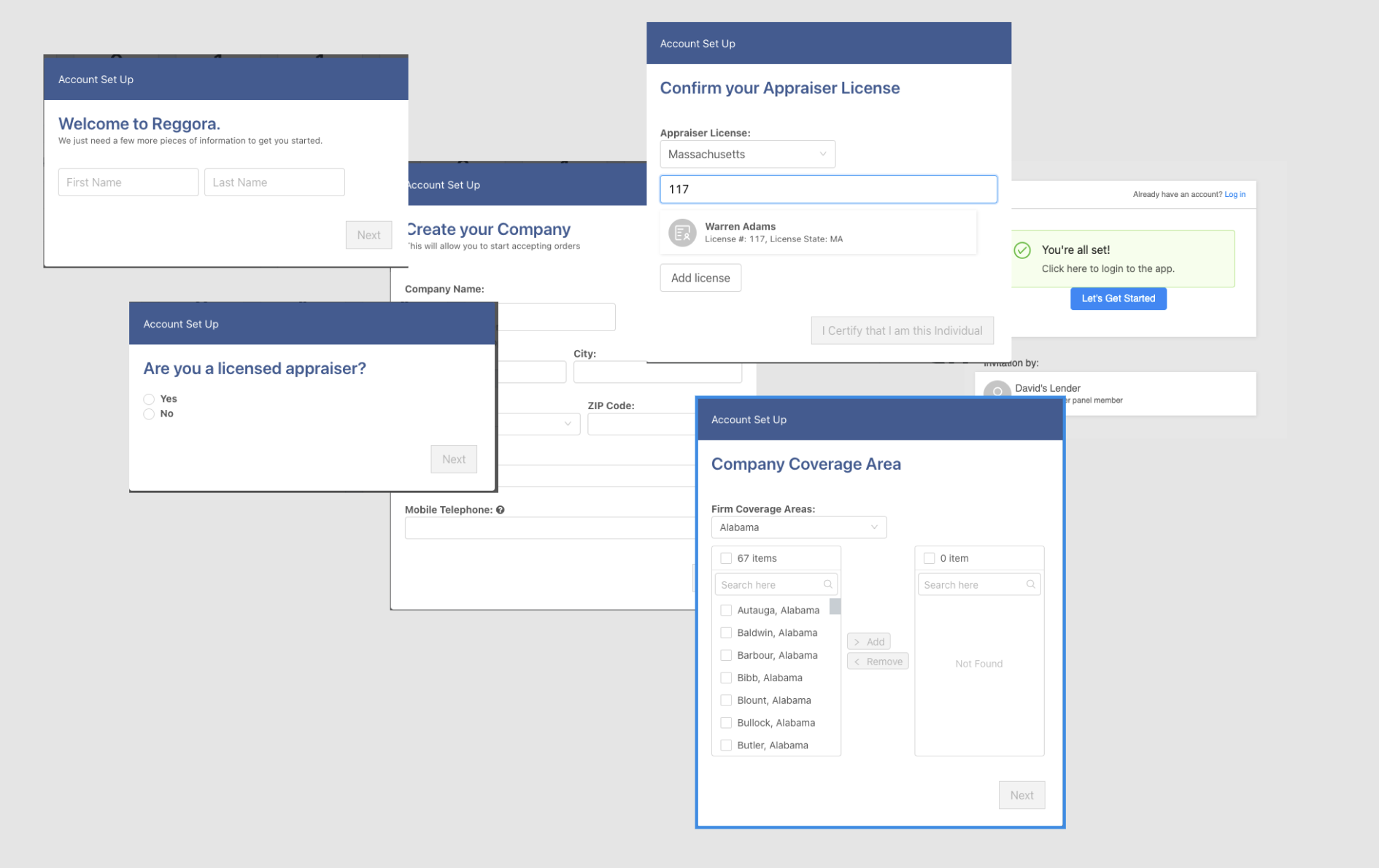
Screenshots of initial sign up flow
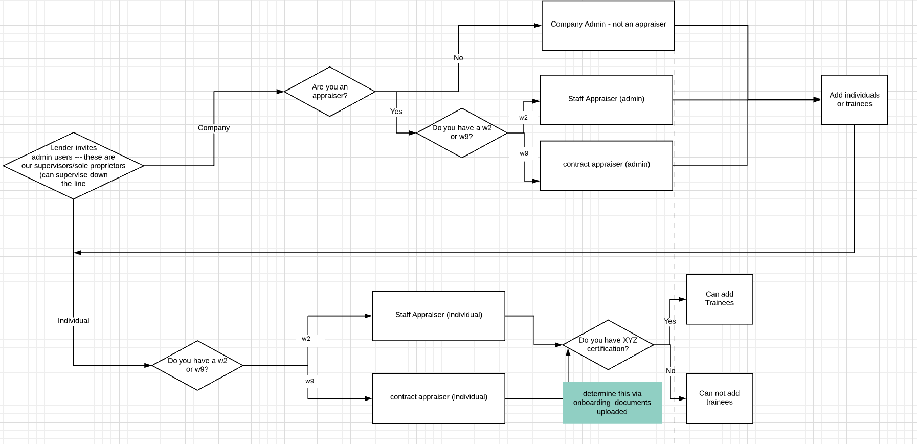
After collecting the major pain points and driving down on the problem, I created basic frameworks for understanding what information was needed in sign up, and account setup. The goal here was to have everything needed to accept an order happen during sign up, so users can start using the software immediately. Anything else needed for account setup that was not a blocker to accepting an order would be in clearly outlined account set up steps.
Below is the flow created to quickly determine what type of account a user needed:
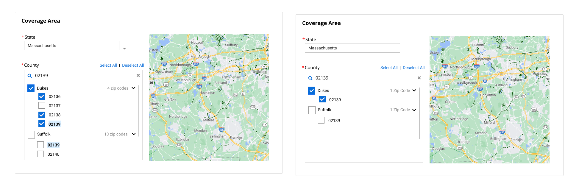
Next, I started working on ways to minimize manual data input for the user, while ensuring data accuracy. This included items like only requiring payment information from management accounts, using government APIs to autofill information based on appraiser license numbers, and allowing users to select which address they start their day from for proper order allocation. A good example of this is ensuring that our map components could be set up for large swatches of the country quickly for company accounts, and down to the zip code level for individual accounts.
Iterative Design
Each part of the process had iterative design work, that was discussed collaboratively with product and engineering to decide on the best solution. here are some initial design for coverage area:
Once a direction was decided on, I worked to iron out the interaction details of different states.
This process was repeated for each area of the project, working on many areas simultaneously.
The Solution
The final solution was a streamlined sign up process from initial invitation email through account setup. It took into account user types, adjusting the form for the user so it would be quick, easy, and straightforward. The set up process preps a user for what information will be needed, provides transparency into why sensitive information is required, and walks them through the process every step of the way. Please view the prototype for an individual account:
The onboarding redesign saw an increase of app conversion (users able to sign up and have accepted their first order) from 34% of users to 74% of users. It also changed abandonment in the sign up flow from 60% of users dropping to 4.5% of users dropping.