Home Inspection App
Collecting necessary data on homes without professional training
The Goal
Fannie Mae and Freddie Mac, two government-sponsored home loan purchasing companies, have released new loan types that allow individuals to bypass the appraisal process when buying or refinancing a home. However, data on these homes is still needed. Our goal is to create an app that allows realtors to collect the necessary data on the home to be able to close. Requirements from both Fannie Mae and Freddie Mac needed to be collected simultaneously, allowing lenders to sell their loans to either entity.
Process
The first step in this process was researching user needs and understanding the scope of the data needed. This was done in three ways:
1. Competitor research. Though access to competitor apps was limited, I was able to collect information on user needs in 2 ways. The first was collecting mobile app reviews from competitor products to learn about the pain points users were experiencing. The second was interviewing appraisal experts to understand the data quality needed, as well as frequent issue areas when inspecting a home that needed extra attention.
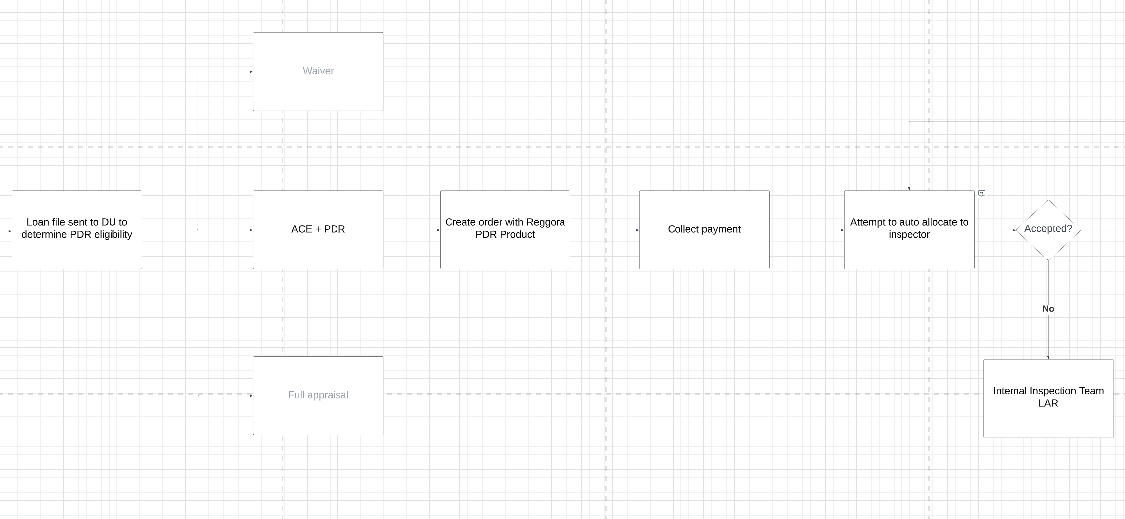
2. Workflow Ecosystem Mapping. A workflow was created to understand how the new product needed to fit into our existing product suite workflows, including existing integrations with outside software. This allowed me to understand the technical constraints. One piece of this flow is below:
3. Data Requirement Synthesis. The high level needs from Fannie Mae and Freddie Mac were analyzed and combined, allowing me to create the basic architecture needed for our software.
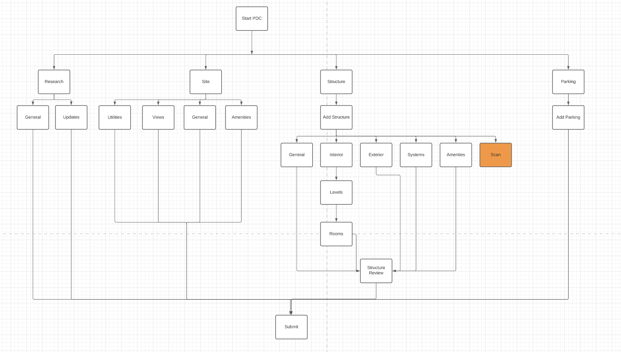
Here you can see one item that was added from reading through user research: the Structure Review section. Users stated repeatedly that entering information for each room was cumbersome and repetitive. Working with an appraisal expert allowed me to determine which room specific requirements would almost always be the same across the entirety of a home, and ask a user once.
Next, I needed to dive deep into the data requirements, analyzing both sets of requirements (400+ data points each) to create one structure.
There was two parts of this — One was developing question type components. Determining a basic set of question types allowed quick iterations without one off builds. And allows engineering to start building the application without all the questions being written.
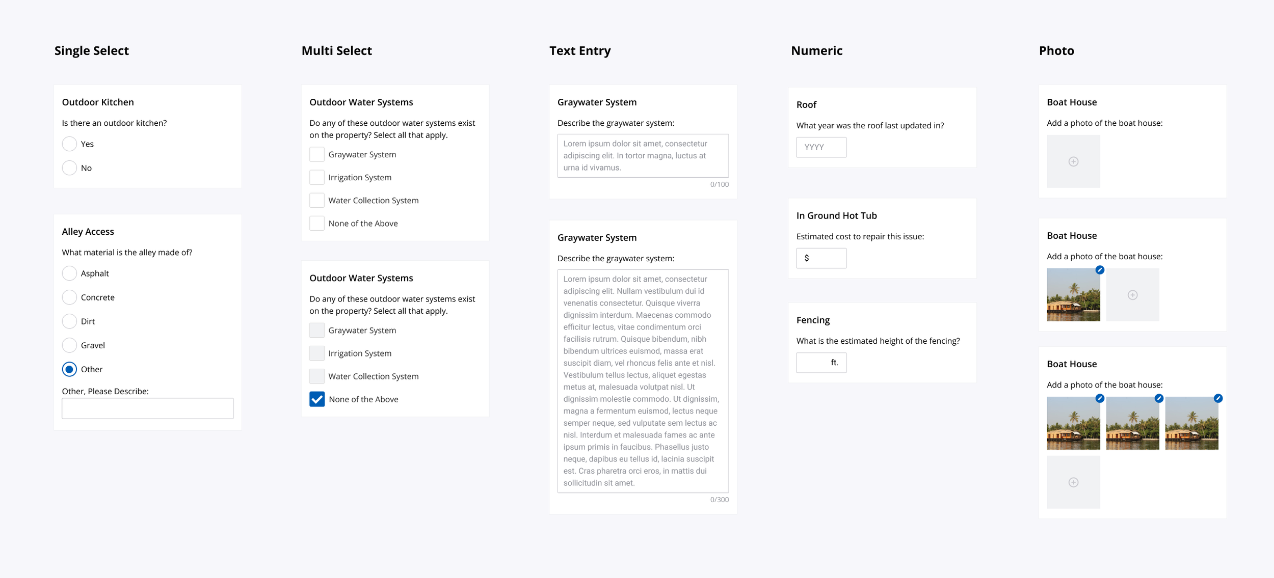
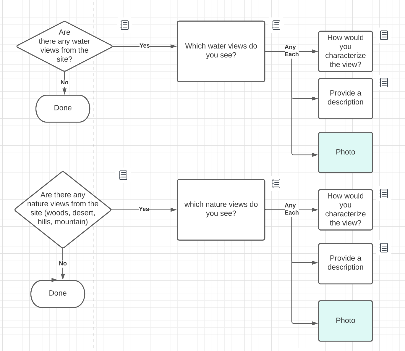
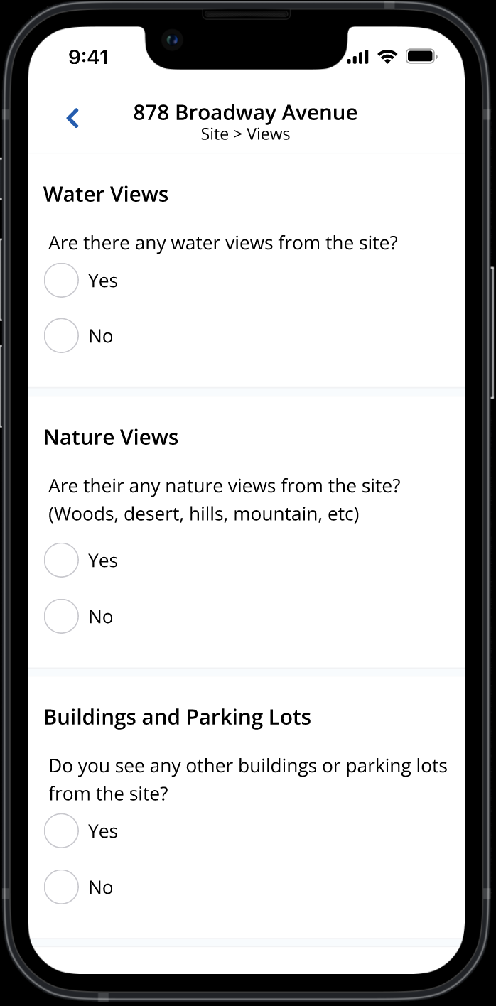
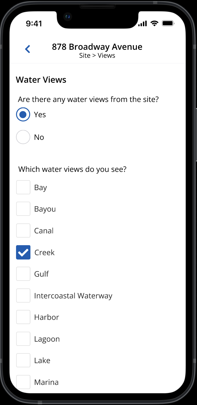
The other was writing the questions themselves. This meant creating dynamic forms to balance speed and accuracy. As an example, here is a one requirement on what views can be seen from the property.
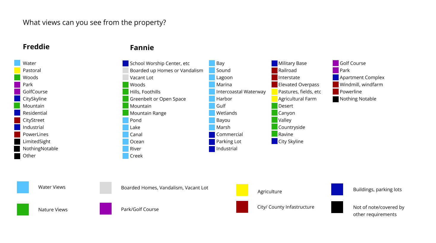
I took the 60+ answer options and created easy to understand groupings. From there, I created dynamic questions to collect only the relevant information quickly. Here you can see the underlying logic of the form, and the form itself.
Iterative Design Process
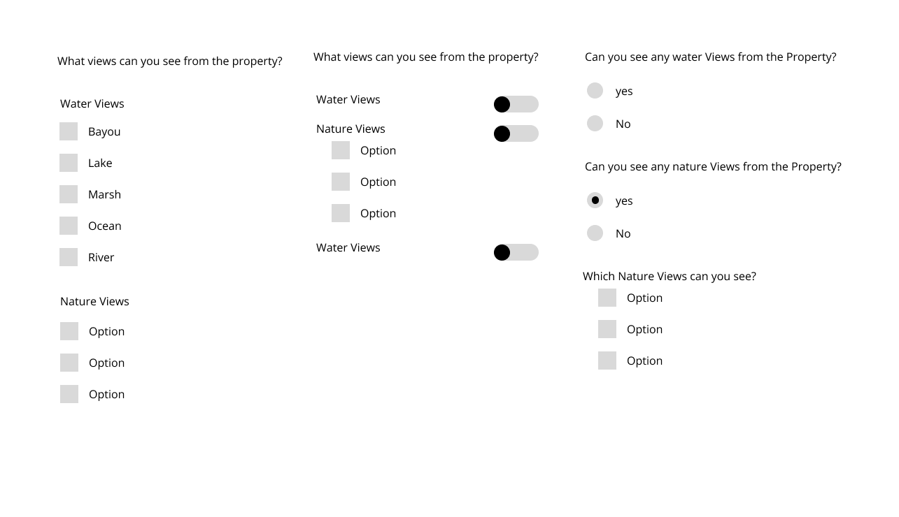
Each part of the design received an iterative design process. Starting with low-mid fi designs to discuss the pros and cons of each option with product and engineering. Here are some of the early options for the views section, while playing with what question types we wanted to start with:
Deciding on An MVP
The Main Bulk of the first iteration is the form software, scaled back to only what was necessary for accurate testing.
To allow for quick scanning and chunking of information, the form is divided into 4 main sections. From there, a user nail dive down into subsections. MVP uses just two navigation models — nested navigations with a push animation, and full screen modals with a pop up animation.
Each form starts with base questions, divided into cards. This allows us to chunk information and scan easily. Dynamic form attributes allow us to show the user the minimal amount of information necessary at any given time and walk a user through collecting complex pieces of information.
In Addition, we used the home screen and order details of the application to help users keep track of open tasks, and push towards the next task to complete. Here, I was able to play with some experiments on how to motivate a user.
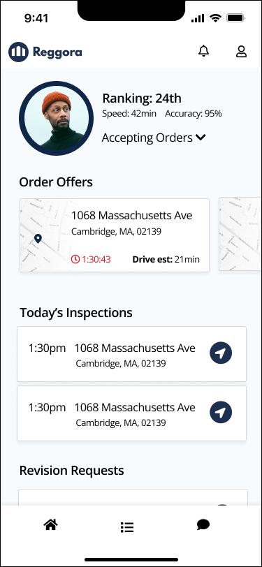
Ranking gives quick statistics and gamification. Monetary incentives given to raise ranking.
Time count down incentivizes quick acceptance. Horizontal scroll to save space, as only 1-2 offers expected at a time.
Drive time for quick distance measure.
Navigation link for today’s inspections to open directions in default map app - save time and ease of use.
Testing
This app has been released for internal testing, with a survey and focus group structure for collecting initial feedback. The feedback allows us to iterate on the first design before releasing to a pilot group of real estate users. Early testing allowed us to find areas of friction in our photo capturing flow, and adjust this flow based on the actual use of the app.
The first photo flow:
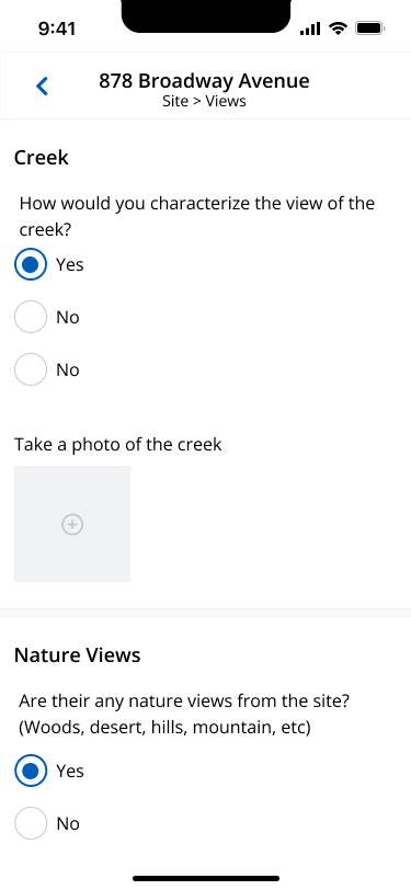
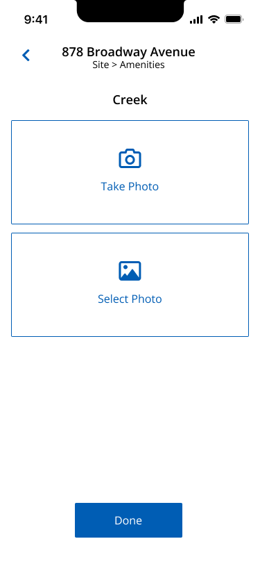

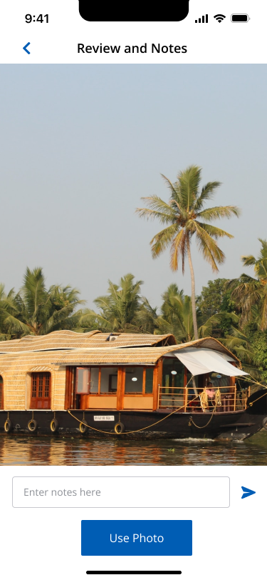
Initially, we built the photo capturing flow to allow users to easily choose between taking a photo, or selecting from existing photos. However, we quickly learned that users found this time consuming. We were able to verify that users need to take a new photo the vast majority of time. However, users still needed to be able to access selected photos for when they made a mistake and wanted to switch the photo with one already taken. I built the new flow to prioritize taking a photo, while allowing users to quickly access their photo gallery as needed.
Next Steps
The next steps for this app is to launch to a pilot group of real estate users. I have developed a survey program that will be sent at the first home inspection completion, after 5 completed home, and after 10 completed homes. We will also be measuring the path taken through the form, the time to completion, and the accuracy. This will allow us to measure app success as well as how quickly are users are able to learn the patterns we have set forth.